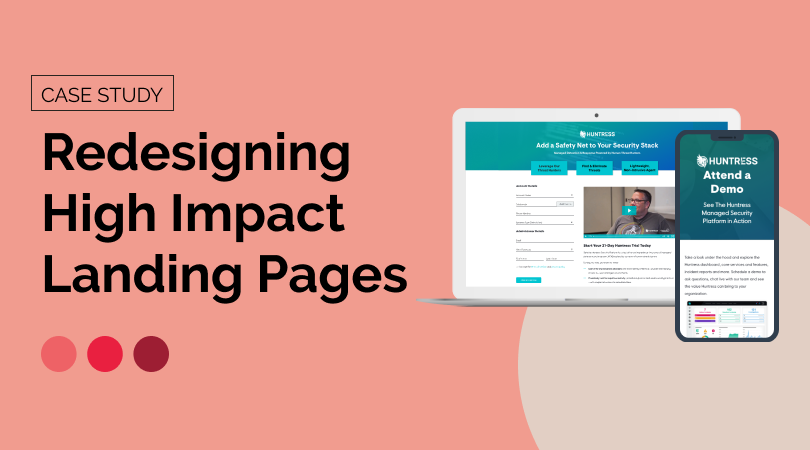
Now that I’m a few months out from redesigning two of the most high impact landing pages on the Huntress website, I wanted to reflect on the process and try to answer what makes a high impact landing page and what elements drive conversion.
The Trial Registration Process

When I first joined Huntress and made my passion for design as a conversion optimization tool known, I took on the project of redesigning the Free Trial Signup experience. That included the landing page where users signed up, and the following digital touchpoints and user onboarding. The conversion rate for the existing page was fairly strong (16%), but the page design was not consistent with the overall site and did not provide enough information to the user.
The first step was to levelset the need for a redesign with our stakeholder group:

Our stakeholder group of Brand + Content leads, the Chief Marketing Officer, and key Sales leads agreed that this project was worth prioritizing. I then documented some goals for this undertaking so that we had something to measure the final product against.

The first step was to start gathering data from Google Analytics, Google Pagespeed Insights, Hubspot (our CRM + CMS), and Hotjar. Not only did we need to establish a baseline for typical web metrics like time on page and view to submission rate, but I also wanted to get a sense of how a user behaved on the existing page; were they getting frustrated? Were they going back to previous pages? Was it clear what was being asked of them and why?

After reviewing heatmaps, scroll maps, watching a lot of user recordings, and looking at the data, it became clear that there were opportunities for improving the user experience in terms of information but also function:

The current page wasn’t loading fast enough, wasn’t accessible, and wasn’t giving the users the information they needed to quickly make an informed decision. Now that we knew the weak points we needed to address, and had a good understanding of how our user base (aligned with our existing Marketing personas) was behaving, I compiled some inspiration and best practices.

Knowing what information we needed to prioritize and industry best practices, I began creating wireframes.

Once my team and I decided this was the right direction, I created high fidelity mockups that we could present to the stakeholder group. We knew we needed to prioritize the top three value propositions, what would happen during the trial period, and social proof in the form of partner testimonials. We also wanted to include a testimonial video to instill more trust with a real partner sharing their experience on camera.

After gathering feedback from our stakeholder group, we decided the following design was the strongest, and iterated on it:

This version highlights the value propositions, clearly and visually outlines what happens during the trial, has a testimonial video, and provides some stats about the Huntress platform.
With our resources at the time, we knew there would need to be some tweaks once this was created in Hubspot. Since I had already been learning Hubspot as a CMS, I decided to undertake building the page myself in the Hubspot Design Manager (when we later had more resources, this was properly recreated by our development team to be more easily editable).

We ran into some limitations, as to be expected, that meant we had to push some of the content further down the page, but visually it was a cleaner experience that used our existing website modules.
One thing that we had realized during the process was that once the user submitted the form they were redirected immediately into the platform, which could be a bit jarring. We decided to create a Trial Success page that acted as a confirmation as well as a guide to users to answer the question of “what’s next?” This page includes a short video explaining the keys to a successful trial, along with a datasheet that explains those keys in more depth. We also wanted to make sure that users could easily contact the Partner Success team with any questions.


There was an existing nurture email sequence that we now needed to overhaul, in terms of visuals and content. Content writer Rachel Bishop retooled all three emails to guide the user through the trial process and I redesigned the visuals of the emails to match the new web experience and Huntress branding.


With all three touchpoints launched, we began to collect data and validate our hypotheses. After some time, we saw the view to submission rate climb to 21% (it was previously 16%). Recent Hotjar click maps indicate users are utilizing the testimonial slider and watching the testimonial video, validating the need for social proof that was previously missing.

While we are still running A/B tests on the trial page, I turned my focus to one of the other most important pages on our site: the demo page, which suffered from many of the same problems as the old trial page had.
The Demo Page

Because we had recently completed the trial redesign and had seen success, we used that as the model for the demo page and were able to use it as a framework.
A lot of the reasons to redesign the page were similar to the trial page:

With similar goals for the outcome of the project:

We repeated the research process so that we could set a baseline for the page performance, and examined user behavior on the current page to see the pain points.

I also gathered some inspiration and best practices for landing pages that are very form focused.

Because we planned to use the trial page as a framework for the visuals (and to be cohesive with the rest of the site), I did not create wireframes but went right to high fidelity mockups.

Drawing on the trial page learnings and design, the demo page provides an at a glance view of the Huntress Security Platform to tease what the user will see in a live demo, and provides social proof in the form of partner testimonials in a carousel.

As with the trial, our stakeholder group reviewed the mockups and selected the above as the layout to pursue.

Having learned our technical constraints, the first published version of the redesigned page did not differ widely from the final mockup; the only changes were subtle, visual changes. We also revamped the content to make it more relevant and straightforward.
What I did not expect was that only a few months after launching the new demo page, the conversion rate (form submissions/pageviews) had increased 46% and our view to submission rate was up to 19%.
Given that we were able to make a significant impact on the conversion rate of both of these pages, I wanted to think about and put forth some potential answers to the question of what makes a high impact landing page?
What makes a high impact landing page?
Based on my experience with these redesign projects, a high impact landing page needs to have the following:
A clear call to action that has a higher level of effort, like a form
It’s a relatively easy ask for a user to click a button, but taking the time to fill out a form means the user expects something more in return, and the brand is receiving something higher in value than a single click metric (lead information, etc)
Clear value proposition(s)
What is going to make this user fill out the form? What pain points will this action solve? With the Huntress Trial, by completing the form the user is granted access to the platform for 21-days to see how it works and how effective it is.
Cohesive visual appearance
It’s extremely jarring to go from one page on a website to another page that looks completely different and visually disconnected from the one you came from. A lack of visual cohesiveness leads to confusion and potentially event doubt, lowering the chance that the user will take that high-value action.
Social proof (testimonials, stats, etc)
It’s a bit silly to say “but don’t take my word for it,” but that’s what users need to see. Any company will tell you their product is great and you should fill out their form, but what about the people who have gone before them? Did they literally get what they signed up for?
In summary
I learned so much and flexed so many new skills throughout this process, from being able to really leverage analytics and user behavior data to dusting off my wireframing skills. The increase in conversion rates provided proof that design can have a huge impact on conversion, and really demonstrates that it’s not just about “making it pretty” but presenting information in a way that makes sense, is easy to understand, and solves a problem or pain point for the user. On the other side, higher conversion rates on pages like these lead to more leads (pun was unavoidable), and therefore more revenue.
More cohesive brand appearance? ✅
Better user experience? ✅
More revenue? ✅